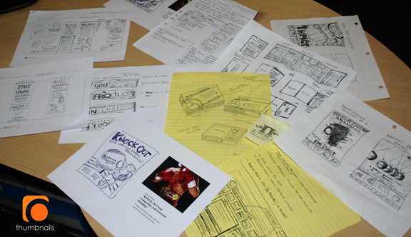
“In a world of fast-paced digital design, I fear that good old pencil thumbnails are being forgotten. “
I have been in the field of graphic design for what seems ages, starting in 1990. I have been a design student, graphic design instructor at the Art Institute of Pittsburgh, designer, art director and senior partner of ocreations design studio in The South Side of Pittsburgh.
I have always been a firm believer that designers need to be able to draw or bring their concepts to life on paper in order to sell their ideas to clients, art directors, designers, photographers and other people in the industry. In the field of graphic design, the most important thing we are paid for are our original concepts. I feel that pencil thumbnails are the best and fastest way to take these concepts from inside your head to a format that others can view.
I wish I had $1 for every quick sketch on napkins, post-it notes, notebooks, notepads and desk calendars I did throughout the years. All of these super rough sketches are unleashed ideas. I honestly believe that if I waited until I developed them on a computer, they would either have been forgotten or become watered down.
If you are considered an artist or painter you are expected to be able to draw. If you are a graphic artist you are also expected to be able to draw. When you are labeled a Graphic Designer does that title make you exempt from the drawing portion of it? In my mind it does not. I understand that the level of illustration and hand skills varies and that is ok. I personally do not believe that I am a fantastic illustrator but I know that I can still get my ideas across to people through my sketches.
The Art Institute of Pittsburgh’s graphic design department hosts a meeting with industry professionals to hear what they would like to see more of in our graduate portfolios. The answer now, more than ever, from these professionals is: “We need to see more pencil thumbnails and original concepts.” I personally was thrilled to hear this because it gave me support for my beliefs.
So for the non-believers who think the idea of pencil sketches is a thing of the past, here is where I feel they
are a big help:
- Getting the idea out fast.
- For a designer to sell his ideas to an art director or team member.
- For an art director to give fast direction to a designer or copywriter.
- For a designer or art director to provide direction to a photographer or illustrator.
- For a designer to get on the same page fast with a client.
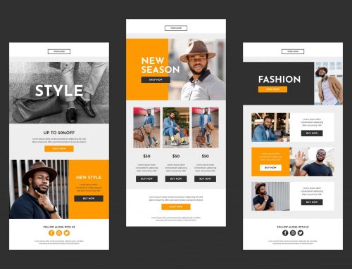
- To get the real idea on paper without the computer dictating your direction.
- To illustrate different concepts prior to computer variations on an approved concept.
- To keep the ART in Graphic Artist (sorry had to do it).
- To keep the client focused on the general concept and not allow them to get hung up on exact fonts, colors or images in the early stages.
I hope this endorsement helps sell my ideas and keeps pencil thumbnails alive.
If you are going to start doing pencil sketches or if you are already using them, here are some simple tips to consider:
- Keep your thumbnails in proportion to the actual size of the job.
- Use good contrast to allow things to POP.
- Do a good indication of type (serif vs. sans-serif, leading, justification etc.).
- If you do not provide a contact sheet for images, then do a tighter indication of the images on your thumbnails.
- Try different concepts to reach the client’s objectives and target market, not just variations of the same idea.
- Use a grid. This really helps on multiple page publications.
- For thumbnails of multi-page publications, show a cover and 2 spreads for each thumbnail set.
- Be original, be creative and have fun.
As the Senior Partner for ocreations I always practice what I preach and provide my designers, photographers and clients pencil sketches when needed. I hope that this post helps get the pencils back out in the field and keeps the ideas flowing.
For all your design solutions THINK DIFFERENT. THINK ORANGE.


